Monday, October 22, 2018

PTE Describe Image Practice

Look at the graph below. In 25 seconds, please speak into the microphone and describe in detail what the graph is showing. You will have 40 seconds to give your response.

PTE Describe Image Practice

1. PTE Describe Image Practice Question

pte describe image practice

The image seems to be a kind of a pie chart that is divided into five different size portions showing the healthy options to eat. Bigger the portion, healthier the food. The different parts of the plate suggest various edible items to bring in homeostasis (or physical and mental balance). There are two large portions of the plate; one shows fruits and vegetables, and the other one has bread, rice, potatoes, and pasta. Slightly little than those portions are the parts of milk or dairy products, and poultry and meat. The smallest part of the Eatwell plate is of foods and beverages having high fats and sugars. Overall, we can conclude that to remain alive and kicking we should be eating a very well-balanced diet.


2. PTE Describe Image Practice Question with Answers


The picture illustrates three different meanders or loops with some route of water. In the very first image, the water flows through the meander; however, due to the force of the water, the narrow neck of the meander starts getting eroded. The next image shows the progress of depositions that take place filling the narrow neck of the meander. The water is now swiftly flowing through the quickest route almost cutting the meander's narrow necks. The final image shows that the meander is completely severed and the water smoothly flows through the new route which is shorter and quicker. We can conclude that water has found its own route bypassing the meander.

3. PTE Describe Image Practice Line Graph


The figure is a line graph showing the depression probabilities in humans as they grow. The scale of the age starts from teenage that is 16 and ends at 70. The probability of depression is mentioned in decimals from 0.001 to 0.023. The line takes a curved shape as it starts, reaches its peak, and finally ends. At the age of 16, the depression probability is the least which is close to 0.003 but is gradually increasing as the age advances. The peak of depression shown stays between the age of 40 and 48 years and then on, it drops significantly to approximately 0.007 when a person reaches in his 70s. Overall, we can conclude that the probability of being depressed is more during the middle age and is least in teenage and old age.

4. PTE Describe Image Practice Maps


The given picture seems to be of two flags of some countries. Surprisingly, both the flags have same colors that are red, green, white, and black, but the patterns in both of them are different. If I talk about the first flag which is on the left side of the picture, it has a rectangle painted with red color, and it is vertically placed in the left-most corner of the flag. The stripes are then in order of green, white, and black upside down. Coming to the second flag which is on the right side, the rectangle is replaced by a triangle with a white asterisk in it. The order is totally opposite to the first flag that is black, white, and green from top to bottom. Overall, the two flags of some countries have the same vibrant colors in their flags, but the pattern is little different.

5. PTE Describe Image Practice Line Graph


PTE Describe Image Practice Questions


The picture is of a line graph on a rough-scaled paper showing the product sales for three years. The X-axis is labeled with the years 2000, 2001, and 2002 whereas, on the Y axis, we have the units of product sales from 100 to 250 gallons. The three lines show snacks, food items other than snacks, and soft drinks as selling products. The food items are the only products that witnessed skyrocketing growth in selling from 200 to 250 gallons in those three years whereas rest of the items that are snacks and soft drink initially surged in 2001 and then dropped in 2002. All in all, the given data reveals that food items are more popular as compared to snacks and soft drinks as far as selling is concerned.

6. PTE Describe Image Practice Pie Chart


pte describe image practice questions


The two pie charts compare the percentages of online sales across different retail sectors in Canada in the years 2005 and 2010. In 2010, Food & Beverage captures the largest proportion of the online market with 32% market share while Home Furnishings holds the smallest portion of online sales. During the five-year period, we can see that people are preferring to purchase the video game and food & beverage online whereas online sales of home furnishing industry & electronics and appliance have fallen considerably.

7. PTE Describe Image Practice Sample


PTE Describe Image Practice


The dual image of a Venn diagram and a triangle puts light on the comparison of the fundamental needs model with Abraham Maslow's hierarchy of needs. On the left-hand side, we have a multicolor Venn diagram showing three basic needs that are status, stimulation, and security needs. These needs are then represented in a triangle with their examples from top to bottom. The top is filled with self-esteem and actualization needs such as creativity and respect followed by belonging needs like friends and family. The last two portions of the triangle show the security needs which means freedom from fear and physiological requirements like food, water, and shelter. We can conclude that these two models show crucial information on our needs.

8. PTE Describe Image Practice Exercise


There are five images of the world map in one picture. The atlas in all the images appears differently according to the eras mentioned just below each of them. The very first atlas belongs to the era of Permian dating back to 225 million years. Pangaea was the only landmass then. The world was then divided into two large landmasses Gondwanaland and Laurasia in Triassic era that was 200 million years ago. Our modern world started forming in the Jurassic era that was 135 million years ago. By now, one could easily identify all the continents, but still, they were fused. The final image shows the Cretaceous era that was 65 million years ago where all the continents were split giving the shape that was almost same to the present atlas.

9. PTE Describe Image Practice Guide


The geological picture is of the earth divided into 3D cross-sections. There are several layers shown in the picture with different color shades. The blue layer is called atmosphere whereas just after that the layer is called crust. If we go even deeper, the mantle layer forms the middle portion of the earth, and the innermost portion is made of the outer and inner core. There is also a triangle shaped section that describes the layers in detail. The uppermost layer is labeled with oceanic crust and continental crust followed by the upper mantle. The mantel runs further down to meet the outer core of the earth. Overall, we can conclude that the earth is made up of many layers of different sizes.

10. PTE Describe Image Practice Questions with Solved Answers


pte describe image practice LINE GRAPH
PTE Describe Image


The dual horizontal line graph provides a crucial piece of information on the pay gaps in Scotland and the UK for men and women for the period of 1997 to 2005. The Scotland pay gap is marked with a blue line whereas the UK pay gap is shown by a dotted line. Both the gaps are measured in percentages. While both the countries' gender pay gap shows a steady fall from between 15 and 20 percentages to 7 and 14, the dotted line that is the UK pay gap remains constant even in fall. The Scotland pay gap's line shows some zigzag pattern from 1997 to 1999. To conclude, the gender pay gap for both the countries has gradually got down.

PTE Real Exam Questions Describe Image

Look at the graph below. In 25 seconds, please speak into the microphone and describe in detail what the graph is showing. You will have 40 seconds to give your response.

PTE Real Exam Questions Describe Image


1. PTE Real Exam Questions Describe Image


The line graph illustrates the population of those aged 15-24 years old from 1990 to 2015 from different areas around the world. The Americas, the Middle East, and North Africa have relatively stable youth populations. Sub-Saharan Africa and South Asia, on the other hand, has seen a doubling of its younger population. East Asia and the Pacific shows a unique fluctuating trend. It has one of the highest youth populations at nearly 400 million, but dips in 2000 and rises again in 2007. By 2015, it falls back again to just above 400 million. In summary, the largest growths in youth population can be found in Asia and Africa.

2. PTE Real Exam Questions Describe Image

PTE Real Exam Questions Describe Image


The above graph represents information about men and women who are attending classes at different times in a day. It can be seen in both pie chart and a line graph that more than 70% women prefer morning classes as compared to 25% of men. However, for afternoon classes, 60% of women prefer this time as compared to about 40% of men. For evening classes, we can see that about 60% men prefer evening classes as compared to just 40% women. This variation can be due to working hours, or safety and security of women during late evening hours.

3. PTE Real Exam Questions Describe Image

PTE Real Exam Questions Describe Image

PTE Real Exam Questions Describe Image


This pie chart illustrates percentages regarding the amounts of cotton candy sales based on age. 30% of total sales are made to people 30-39 years old, whereas the age groups of people 40-49 years old, and children 12 years old or younger, are responsible for only 8% of total sales each. Kids 13-19 years old are responsible for 20% of sales. Young adults 20-29 years old, and people 60 years old or more are responsible for 14% of sales, respectively. Finally, adults 50-59 years old, only purchase 6% of cotton candy.


4. PTE Real Exam Questions Describe Image


This pie chart seems to refer to a specific person's view on what their friendships are built on. Thus, this person considers that 50 per cent of their friendships are built on insult-based humor; 40 per cent of their friendships are built on pun-based humor; only 9 per cent of their friendships are based on similar music tastes; and only 1 per cent of their friendships are built on connections on a deep and psychological level.

5. PTE Real Exam Questions Describe Image


This pie chart illustrates the distribution od car sales between six companies. GM holds the highest percentage: 35%. Ford, on the other hand, holds the lowest percentage: 4%. Maruti holds 24% of car sales; Hyundai, represented in orange, holds 15% of car sales, followed by Fiat, represented in dark blue, which holds 12%; lastly, holds 10% of car sales.

6. PTE Real Exam Questions Describe Image


The pie chart illustrates the religious status of people around the world by percenatges. 33.32% of the world population, which is the largest group, is Christian; 21.01% of people are Muslims; 13.26% of people are Hindus; 5.84% of people, the smallest percentage, are Buddhists; and 12.48% of people belong to other religions. Non-religious paople make up the remaining 14.09% of the population.

7. PTE Real Exam Questions Describe Image


The dual line graph shows the cigarette prices in the United States and cigarette consumption between the span of 1970 and 2007. [The source is taken from The Tax Burden on Tobacco, Economic Research Services.] If we track the cigarette consumption that are in billion packs, it starts with around 27 consumed in 1970 that increases steadily till 1982 and then starts falling drastically while reaching to 2006. On the other hand, the average retail packs' prices that are in dollars is going up from around two dollars in 1970 to touching USD 4.25 in 2007. Overall, I can say that while cigarette consumption has gone down in the given years, the prices of cigarette packs have skyrocketed.

8. PTE Real Exam Questions Describe Image


An informative multiple-line graph shows the worrying condition of the total greenhouse gas emissions in the United Kingdom. There are three lines that depict the actual emissions, the projected range, and the target of gas emissions in a million tonnes. While it is a relief that the actual emission had dropped significantly from around 750 million tonnes in 1990 to little below 650 million tonnes in 2000, it is very surprising to mark that the projected range then shoots up and touches the mark of 680 million tonnes. The actual target set is around 640 million tonnes. To sum this all up, we can say that the gas equivalent to carbon dioxide would rise instead of falling

9. PTE Real Exam Questions Describe Image


The image is a world map that shows all the continents and the major wildfire events within those landmasses. It is clear from the image that in the continents of South and North Americas, the major wildfire has grown significantly as in 1950, there was hardly an event of two, but in 2000, it had reached to 45. If we talk about Asia, the events will have become more frequent from 1970 which is the same case for Oceania. The continent of Africa, compared to other places on the map, is lucky to have fewer events of major wildfires. Finally, I can conclude that all across the world, the events of major conflagrations in forests have significantly increased in a few past decades.

10. PTE Real Exam Questions Describe Image


The map image is labeled as HadCM3 model, IPCC SRES A2 scenario. It is pretty visible that most of the top or northern portion and some portion in the south of the continent is painted with gray which means the lands here are not suitable for cereal growing. The middle portion of the map is marked with off-white color showing that there is no or ignorable change in cereal production. The topmost portion and some portion in the south are of a red color which means it'll have decreased output -50% of more. The green shades are scattered across the map showing 5-25% increase. Overall, the map shows the mixed information on cereal output.


Describe Image PTE Practice Sample Questions and Answers

Look at the graph below. In 25 seconds, please speak into the microphone and describe in detail what the graph is showing. You will have 40 seconds to give your response.


Describe Image PTE Practice


1. Describe Image PTE Question

describe image pte question answer

Describe Image PTE Practice

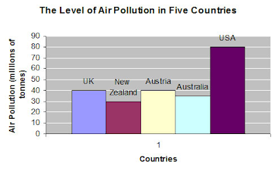
The graph represents the Air pollution in terms of millions of tonnes on the y axis and countries on X asix. It aims to give a conclusive analysis on the amount of air pollution in five countries namely UK, New Zealand, Australia, USA. The air pollution is highest in USA with 80 millions of tonnes and least in New Zealand with 30 millions of tonnes. With the alarming increase in Air pollution, now is the time to take measures against air pollution.

2. Describe Image PTE Sample

describe image pte exercise

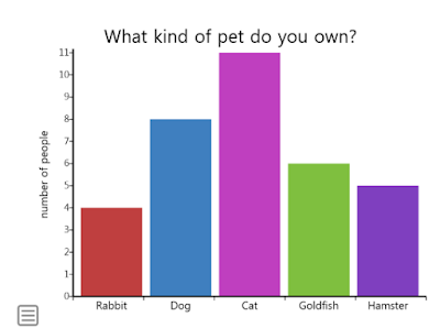
The above graph shows a survey conducted among 35 members on what kind of pet they own. Eleven members own cat as a pet. Eight members own dog as a pet. Six members own goldfish as a pet. Five members own hamster as a pet. A very less number of people own rabbit as a pet.

3. Describe Image PTE Exercise


The above graph shows the serious crime rate in Cincinnati. In 2001 twenty-six thousand crimes were registered. In the year 2002 and 2003, most of the crimes were registered. Though there was a decrease in registration of crime rate in the year 2004, 2005 and 2006, they were equal to the crimes registered in the year 2001. The year 2007 and 2008 registration of the crime rate was the least. On an average serious crime rate in Cincinnati was around 26000 between the years 2001-2008.

4. Describe Image PTE Bar Graph


Above is the graph with ratings of six Pixar movies. The highly-rated movie is Ratatouille, it was rated 96. And the least rated movies were finding Nemo and The Increadibles. The next highly-rated movie is Wall-E. Toy Story 3 and Toy story were equally rated at 92. All the Pixar movies got good ratings, with an average rating of 92.

5. Describe Image PTE 2018 Bar Graph

describe image pte practice sample

Everyone has a choice of flavor in ice-creams. Above is the graph, which shows the favorite ice cream flavors people like. The least liked Ice cream flavor is cookies and cream. The most liked Ice Cream is Vanilla. Chocolate and strawberry got an average response compared to other two flavors.

6. Describe Image PTE PIE CHART

The above pie chart shows the percentage of people using the medium to listen to music in 1983 and 1993. Cassettes were mostly used in 1983, whereas in 1993 CD's were mostly used. The second largest medium was LP/EP in 1983 and 1993 it was cassettes. CD's and Vinyl single were least used in 1983 and 1993 music videos, LP/EP, the vinyl single least used.

7. Describe Image PTE Process


The above picture shows the life cycle of a Honey Bee. A queen bee lays eggs, it takes three days for the eggs to hatch. After hatching the eggs turn into Larva, after 9 days in the larva stage, it moves to the third stage. In the pupar stage, the third stage body starts to form. In the fourth stage, that is the adult stage, complete body is formed.

8. Describe Image PTE Repeated

The pie chart provides information concerning browser usage on wikimedia in October of 2011. I.E for instance, was used 34.2% of the time, followed by Firefox, which was used 23.6% of the time; chrome was used 20.6% of the time; Safari was used 11.2% of the time; Opera was used 5.0% of the time; Android was only 1.9% of the time; and other browsers combined were used 3.5% of the time.

9. Describe Image PTE Real Exam Question


This pie chart refers to the average annual deaths attributable to cigarette smoking in the U.S. in 2005-2009. According to the chart, more than 479,989 deaths in that period are attributable to cigarette smoking. Specifically, 29% of these deaths were caused by lung cancer; 28% were caused by ischemic heart disease; 21% were caused by chronic obstructive pulmonary disease; 10% were caused by other related diagnoses; 4% were caused by stroke; and 8% of annual deaths from 2005-2009 attributable to cigarette smoking were caused by other cancers.

10. Describe Image PTE Exam Preparation


The given graph represents the Children employment rates or otherwise the child labor rates across the years 2004 and 2008 in few regions of the world along with the average percentage of the world as well. the highest amount of children employment overall was observed in the year of 2008 in the Sub Saharan Africa region whereas the least amount of child employment was seen in 2008 in the other regions of the world. On an average, the child employment was higher in the year of 2004 when compared to 2008; it is a clear indicator of development.

Thursday, October 11, 2018

PTE Describe Image Speaking Practice Test 2

Look at the graph below. In 25 seconds, please speak into the microphone and describe in detail what the graph is showing. You will have 40 seconds to give your response.

PTE Describe Image Speaking Practice Test 2


1. PTE Describe Image Question


PTE DESCRIBE IMAGE


Rising pollution continues to be a major concern for Delhi. Beijing pollution source says that RK Puram showed a staggering 985 microgram/m3 of particulate matter in the air at 9.20 pm last Diwali. Anand Vihar recorded 758 and Punjabi Bagh recorded 853 microgram/m3 of particulate matter at 3am and 2am respectively that night. Our cities don't lack far behind when compared with other polluted cities of the world; Shenyang (1157), and Beijing (722). However Singapore (471) stands far behind in this regard.

2. PTE Describe Image Question


PTE Describe Image Speaking Practice Test 2
DESCRIBE IMAGE PTE


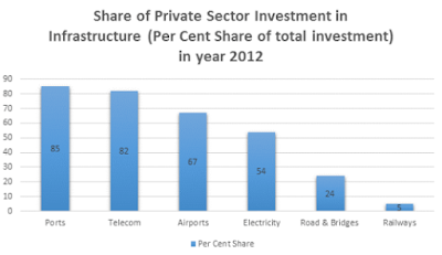
The bar chart indicates the share of private sector investment in infrastructure (% of total share of total investment) in 2012 in India. Port and telecom sector had attracted highest private sector investment, followed by airports, electricity and road and bridge sector. Railways had attracted least private sector investment. As port and telecom sector are more open for private investment than railway they had attracted more private investment.

3. PTE Describe Image Question


DESCRIBE IMAGE


The pie chart represents sector wise electricity consumption in India in year 2014. Electricity consumption is highest in Industry, followed by residential, agricultural and commercial sector. Consumption of electricity in residential and agricultural sector is almost equal to that of the industrial sector. Consumption of electricity in the transportation sector is negligible. Agricultural sector uses mainly to pump out ground water for irrigation.
4. PTE Describe Image Question


PTE Describe Image Speaking Practice Test 2
REAL EXAM DESCRIBE IMAGE


This double bar chart indicates irrigation potential created and utilized in Major and Medium Irrigation projects in India from pre-plan era to ninth five-year plan. According to this double bar chart gap between created and utilized irrigation potential is negligible in pre-plan and first, second and third five-year plan. The gap between irrigation potential created and utilizes is steadily increasing and highest during eighth and ninth five-year plan. The chart indicates that efficiency in exploiting created irrigation potential is decreasing steadily from first five-year plan to ninth five-year plan.

5. PTE Describe Image Question


REPEATED DESCRIBE IMAGE


This double bar chart indicates sanctioned outlay vs actual expenditure in the eleventh five year plan in India. According to the bar chart sanctioned outlay and actual expenditure is almost same during the first second and fourth year of the plan. But during the third and fifth year of the plan, the gap between sanctioned and actual expenditure increased. It indicates that implementation efficiency is higher in the first second and fourth year of the eleventh five-year plan. But in the third year and fifth-year implementation efficiency deteriorated.

6. PTE Describe Image Question


DESCRIBE IMAGE PROCESS


This process diagram depicts hydrological cycle. Through transpiration process water from trees goes up in the air to form a cloud while through evaporation process water from oceans, rivers, lakes and various water body goes up in the air to form a cloud. Condensed clouds bring forth precipitation on earth. Though surface run-off rain water goes to the ocean, river, lakes and various water bodies while through underground run-off rainwater recharge aquifers. Though capillary action trees draw underground water. Hydrological cycle indicates that total volume of water remains same in the system.

7. PTE Describe Image Question


DESCRIBE IMAGE QUESTION BANK


The graph is about to make candy. Sugar, water, flavoring, and other ingredients are cooked. The candy mixture is kneaded to give it a glossy appearance. The candy mixture is cooled to a worldwide temperature. The candies are wrapped individually.

8. PTE Describe Image Question


REAL EXAM QUESTIONS WITH ANSWERS


The picture depicts a typical moorning when people are going to work and kids are going to school. Children are seen patiently lining up while the traffic enforcer stops traffic allowing the to cross. A women is seen with her garbage, probably waiting to dispose of it upon arrival of a garbage truck. Several cars, bicycles, and public transportation can be seen on the road.

9 PTE Describe Image Question


DESCRIBE IMAGE WITH ANSWERS


The picture depicts a scene where a doctor is describing an X-ray to the patieent. The patient is lying bed with blood being transfused. His arm is placed in a case. He listens intently to the doctor who is describing to him the X-ray of his broken arm.

10. PTE Describe Image Question

PTE EXAM DESCRIBE IMAGE


The pie chart illustrates the percentages of European Union population in different countries for the year 2007. As we can see, Germany was the most populous country then with 16.6% followed by France taking off 12.8% of the total population. While the United Kingdom and Italy contributed 12.3 and 11.9% in population respectively, Spain and Poland were smaller countries by population that fell between 7 and 9%. Rest of the 21 countries made the largest portion. Overall, we can conclude that it is the group of European countries with the largest population and not just one country.

Thursday, October 4, 2018

PTE Describe Image Repeated Questions with Answers

Look at the graph below. In 25 seconds, please speak into the microphone and describe in detail what the graph is showing. You will have 40 seconds to give your response.

Repeated PTE Describe Image Questions And Answers


1. Repeated PTE Describe Image Questions

PTE Describe Image Repeated Questions


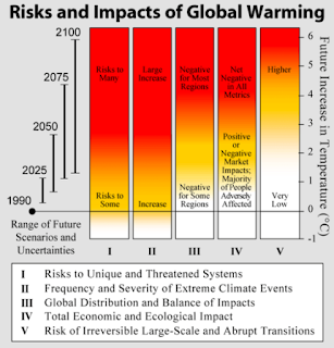
The graph above shows the risks and impacts of global warming through the years 1990 to 2100. The future increase in temperature is depicted in Celsius scale. The risks to unique and threatened systems is seen on the rise by the year 2100, so is the change in climatic conditions. While global distribution and balance of this impact was negative for some regions in the year 1990, it is expected to impact adversely most regions of the earth by 2100. Total economic and ecological impact remains some what ambiguous in the 1990s but registers net negative effect in 2100. The graph also shows that risk of irreversible large scale and abrupt transitions is very low in the 90s but becomes considerable higher in 2100.

2. Repeated PTE Describe Image Practice

PTE Describe Image Repeated Questions with Answers

The trends in urban female education have been quite unsettling over the last decade. The number of illiterate females declined from 442 in the year 1999-2000 to 373 in the year 2004-05. It further declined to 298 in the year 2009-10. The number of females who had completed primary education was 174 in 1999-2000 which increased to 203 in 2004-05 which again declined to 193 in 2009-10. However, the number of females who completed secondary education successfully continues to increase from 281 to 305 and then to 382 in the years 1999-2000, 2004-05 and 2009-10 respectively.

3. Repeated PTE Describe Image Exercise

repeated describe image questions with answers


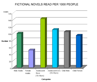
The bar chart shows the information about fictional novels read per 1000 people according to age and gender. Statistics show the number of young male adults involved in this is about 95, with female adults standing around 45. Number of adolescent boys of the age 15 to 18 are quite high at 140, followed by adolescent girls at about 105. Male children stand at a staggering number of a little more than a 100, followed next by female children at 90.

4. Repeated PTE Describe Image with Answer


Obesity continues to be a major problem in many developed countries today. The highest percentage of obese are in US at 74.1, followed by New Zealand at 68.4. Then come Australia and the UK at 67.4 and 63.8 respectively. With 61.1% obese people, Canada stands 5th in the list and Ireland is a little far behind in the race with 46.6% of its population being obese.

5. Repeated PTE Describe Image Sample

repeated pte describe image


There are different types of bullying activities at school that a child becomes a victim of on a daily basis. Majority of them being name calling and insults that count for a whopping 80% of the incidents, followed by shoving / hitting (39%), threats (38%), spreading rumors (29%), cyber bullying (27%), involving friends (24%) and homophobic comments (20%). The less common but equally harmful forms of bullying activities include fighting, sexual comments, exclusion, racist comments, damaging property, stealing and weapon related incidents at 16%, 14%, 13%, 11%, 9%, 6% and 4% respectively.

6. Repeated PTE Describe Image 2018


PTE Repeated Questions and Answers

This pie chart depicts the amounts of fruits that are imported to an unspecified region. Apples are the most imported fruit, representing almost one third of the imports; oranges are in second place, representing a little more than one quarter; in the third position we have pears, which represent almost a quarter; after that, we have grapefruit, which represent half a quarter of fruit imports; and, finally, there are plums, which only represent less than half a quarter of imports.

7. Repeated PTE Describe Image Question and Answer


These pie charts compare the percentages of the populations of the countries of the European Union in 1998 and 2007. Besides 21 countries which are not specified and form a single category, Germany is the country which had the most population in both years: 17.1% in 1998 and 16.6% in 2007. Poland, on the other hand, had the least population in both years: 8.0% in 1998 and 7.7% in 2007. France held 12.5% in 1998 and 12.8% in 2007 -- which means its population slightly increased. The United Kingdom had 12.2% in 1998 and 12.3% by 2007. In general, most nation's populations increased at least a little.

8. Repeated PTE Describe Image Real Exam Question


This pie chart is divided in percentages that correspond to the elements that constitute a recommended diet. Thus, the blue slice, which represents 30% of the pie chart, corresponds to fruit; the green slice, which represents 23%, corresponds to protein; the yellow slice, which represents 18%, corresponds to vegetables; the orange slice, which represents 15%, corresponds to dairy; the brown slice, which represents 9%, corresponds to grains; and the remaining slice, which represents 5%, corresponds to other food items.

9. Repeated PTE Describe Image Pie Chart


This pie chart illustrates the percentages of students from various nations which flew abroad for studies during 2010 (from a total of 200,621 students taken into account). In the case of the USA, 103,968 (52%) students flew abroad for studies; regarding the UK, 38,205 (19%) students flew abroad for studies; 20,429 (10%) Australian students flew abroad; 6,650 (3%) New Zealander students flew abroad; 4,617 (2%) Canadian students flew abroad; and 26,752 (13%) students from other countries flew abroad for studies during the year 2010.

10. Repeated PTE Describe Image Picture Based Questions


This chart shows the social media usage. LinkedIn is the most popular social media. Facebook follows next with 80%. Almost half also use Youtube. Only quarter use Twitter for social media.