Look at the graph below. In 25 seconds, please speak into the microphone and describe in detail what the graph is showing. You will have 40 seconds to give your response.

The graph above shows the risks and impacts of global warming through the years 1990 to 2100. The future increase in temperature is depicted in Celsius scale. The risks to unique and threatened systems is seen on the rise by the year 2100, so is the change in climatic conditions. While global distribution and balance of this impact was negative for some regions in the year 1990, it is expected to impact adversely most regions of the earth by 2100. Total economic and ecological impact remains some what ambiguous in the 1990s but registers net negative effect in 2100. The graph also shows that risk of irreversible large scale and abrupt transitions is very low in the 90s but becomes considerable higher in 2100.

The trends in urban female education have been quite unsettling over the last decade. The number of illiterate females declined from 442 in the year 1999-2000 to 373 in the year 2004-05. It further declined to 298 in the year 2009-10. The number of females who had completed primary education was 174 in 1999-2000 which increased to 203 in 2004-05 which again declined to 193 in 2009-10. However, the number of females who completed secondary education successfully continues to increase from 281 to 305 and then to 382 in the years 1999-2000, 2004-05 and 2009-10 respectively.
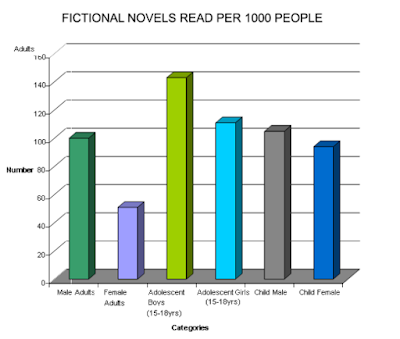
The bar chart shows the information about fictional novels read per 1000 people according to age and gender. Statistics show the number of young male adults involved in this is about 95, with female adults standing around 45. Number of adolescent boys of the age 15 to 18 are quite high at 140, followed by adolescent girls at about 105. Male children stand at a staggering number of a little more than a 100, followed next by female children at 90.

Obesity continues to be a major problem in many developed countries today. The highest percentage of obese are in US at 74.1, followed by New Zealand at 68.4. Then come Australia and the UK at 67.4 and 63.8 respectively. With 61.1% obese people, Canada stands 5th in the list and Ireland is a little far behind in the race with 46.6% of its population being obese.

There are different types of bullying activities at school that a child becomes a victim of on a daily basis. Majority of them being name calling and insults that count for a whopping 80% of the incidents, followed by shoving / hitting (39%), threats (38%), spreading rumors (29%), cyber bullying (27%), involving friends (24%) and homophobic comments (20%). The less common but equally harmful forms of bullying activities include fighting, sexual comments, exclusion, racist comments, damaging property, stealing and weapon related incidents at 16%, 14%, 13%, 11%, 9%, 6% and 4% respectively.
This pie chart depicts the amounts of fruits that are imported to an unspecified region. Apples are the most imported fruit, representing almost one third of the imports; oranges are in second place, representing a little more than one quarter; in the third position we have pears, which represent almost a quarter; after that, we have grapefruit, which represent half a quarter of fruit imports; and, finally, there are plums, which only represent less than half a quarter of imports.

These pie charts compare the percentages of the populations of the countries of the European Union in 1998 and 2007. Besides 21 countries which are not specified and form a single category, Germany is the country which had the most population in both years: 17.1% in 1998 and 16.6% in 2007. Poland, on the other hand, had the least population in both years: 8.0% in 1998 and 7.7% in 2007. France held 12.5% in 1998 and 12.8% in 2007 -- which means its population slightly increased. The United Kingdom had 12.2% in 1998 and 12.3% by 2007. In general, most nation's populations increased at least a little.

This pie chart is divided in percentages that correspond to the elements that constitute a recommended diet. Thus, the blue slice, which represents 30% of the pie chart, corresponds to fruit; the green slice, which represents 23%, corresponds to protein; the yellow slice, which represents 18%, corresponds to vegetables; the orange slice, which represents 15%, corresponds to dairy; the brown slice, which represents 9%, corresponds to grains; and the remaining slice, which represents 5%, corresponds to other food items.

This pie chart illustrates the percentages of students from various nations which flew abroad for studies during 2010 (from a total of 200,621 students taken into account). In the case of the USA, 103,968 (52%) students flew abroad for studies; regarding the UK, 38,205 (19%) students flew abroad for studies; 20,429 (10%) Australian students flew abroad; 6,650 (3%) New Zealander students flew abroad; 4,617 (2%) Canadian students flew abroad; and 26,752 (13%) students from other countries flew abroad for studies during the year 2010.

This chart shows the social media usage. LinkedIn is the most popular social media. Facebook follows next with 80%. Almost half also use Youtube. Only quarter use Twitter for social media.
Repeated PTE Describe Image Questions And Answers
1. Repeated PTE Describe Image Questions

The graph above shows the risks and impacts of global warming through the years 1990 to 2100. The future increase in temperature is depicted in Celsius scale. The risks to unique and threatened systems is seen on the rise by the year 2100, so is the change in climatic conditions. While global distribution and balance of this impact was negative for some regions in the year 1990, it is expected to impact adversely most regions of the earth by 2100. Total economic and ecological impact remains some what ambiguous in the 1990s but registers net negative effect in 2100. The graph also shows that risk of irreversible large scale and abrupt transitions is very low in the 90s but becomes considerable higher in 2100.
2. Repeated PTE Describe Image Practice

3. Repeated PTE Describe Image Exercise

4. Repeated PTE Describe Image with Answer

5. Repeated PTE Describe Image Sample

6. Repeated PTE Describe Image 2018
 |
| PTE Repeated Questions and Answers |
This pie chart depicts the amounts of fruits that are imported to an unspecified region. Apples are the most imported fruit, representing almost one third of the imports; oranges are in second place, representing a little more than one quarter; in the third position we have pears, which represent almost a quarter; after that, we have grapefruit, which represent half a quarter of fruit imports; and, finally, there are plums, which only represent less than half a quarter of imports.
7. Repeated PTE Describe Image Question and Answer

These pie charts compare the percentages of the populations of the countries of the European Union in 1998 and 2007. Besides 21 countries which are not specified and form a single category, Germany is the country which had the most population in both years: 17.1% in 1998 and 16.6% in 2007. Poland, on the other hand, had the least population in both years: 8.0% in 1998 and 7.7% in 2007. France held 12.5% in 1998 and 12.8% in 2007 -- which means its population slightly increased. The United Kingdom had 12.2% in 1998 and 12.3% by 2007. In general, most nation's populations increased at least a little.
8. Repeated PTE Describe Image Real Exam Question

This pie chart is divided in percentages that correspond to the elements that constitute a recommended diet. Thus, the blue slice, which represents 30% of the pie chart, corresponds to fruit; the green slice, which represents 23%, corresponds to protein; the yellow slice, which represents 18%, corresponds to vegetables; the orange slice, which represents 15%, corresponds to dairy; the brown slice, which represents 9%, corresponds to grains; and the remaining slice, which represents 5%, corresponds to other food items.
9. Repeated PTE Describe Image Pie Chart

This pie chart illustrates the percentages of students from various nations which flew abroad for studies during 2010 (from a total of 200,621 students taken into account). In the case of the USA, 103,968 (52%) students flew abroad for studies; regarding the UK, 38,205 (19%) students flew abroad for studies; 20,429 (10%) Australian students flew abroad; 6,650 (3%) New Zealander students flew abroad; 4,617 (2%) Canadian students flew abroad; and 26,752 (13%) students from other countries flew abroad for studies during the year 2010.
10. Repeated PTE Describe Image Picture Based Questions

This chart shows the social media usage. LinkedIn is the most popular social media. Facebook follows next with 80%. Almost half also use Youtube. Only quarter use Twitter for social media.
No comments:
New comments are not allowed.