Look at the graph below. In 25 seconds, please speak into the microphone and describe in detail what the graph is showing. You will have 40 seconds to give your response.
PTE Describe Image Speaking Practice Test 2
1. PTE Describe Image Question
 |
| PTE DESCRIBE IMAGE |
Rising pollution continues to be a major concern for Delhi. Beijing pollution source says that RK Puram showed a staggering 985 microgram/m3 of particulate matter in the air at 9.20 pm last Diwali. Anand Vihar recorded 758 and Punjabi Bagh recorded 853 microgram/m3 of particulate matter at 3am and 2am respectively that night. Our cities don't lack far behind when compared with other polluted cities of the world; Shenyang (1157), and Beijing (722). However Singapore (471) stands far behind in this regard.
2. PTE Describe Image Question
 |
| DESCRIBE IMAGE PTE |
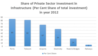
The bar chart indicates the share of private sector investment in infrastructure (% of total share of total investment) in 2012 in India. Port and telecom sector had attracted highest private sector investment, followed by airports, electricity and road and bridge sector. Railways had attracted least private sector investment. As port and telecom sector are more open for private investment than railway they had attracted more private investment.
3. PTE Describe Image Question
 |
| DESCRIBE IMAGE |
The pie chart represents sector wise electricity consumption in India in year 2014. Electricity consumption is highest in Industry, followed by residential, agricultural and commercial sector. Consumption of electricity in residential and agricultural sector is almost equal to that of the industrial sector. Consumption of electricity in the transportation sector is negligible. Agricultural sector uses mainly to pump out ground water for irrigation.
4. PTE Describe Image Question
 |
| REAL EXAM DESCRIBE IMAGE |
This double bar chart indicates irrigation potential created and utilized in Major and Medium Irrigation projects in India from pre-plan era to ninth five-year plan. According to this double bar chart gap between created and utilized irrigation potential is negligible in pre-plan and first, second and third five-year plan. The gap between irrigation potential created and utilizes is steadily increasing and highest during eighth and ninth five-year plan. The chart indicates that efficiency in exploiting created irrigation potential is decreasing steadily from first five-year plan to ninth five-year plan.
5. PTE Describe Image Question
 |
| REPEATED DESCRIBE IMAGE |
This double bar chart indicates sanctioned outlay vs actual expenditure in the eleventh five year plan in India. According to the bar chart sanctioned outlay and actual expenditure is almost same during the first second and fourth year of the plan. But during the third and fifth year of the plan, the gap between sanctioned and actual expenditure increased. It indicates that implementation efficiency is higher in the first second and fourth year of the eleventh five-year plan. But in the third year and fifth-year implementation efficiency deteriorated.
6. PTE Describe Image Question
 |
| DESCRIBE IMAGE PROCESS |
This process diagram depicts hydrological cycle. Through transpiration process water from trees goes up in the air to form a cloud while through evaporation process water from oceans, rivers, lakes and various water body goes up in the air to form a cloud. Condensed clouds bring forth precipitation on earth. Though surface run-off rain water goes to the ocean, river, lakes and various water bodies while through underground run-off rainwater recharge aquifers. Though capillary action trees draw underground water. Hydrological cycle indicates that total volume of water remains same in the system.
7. PTE Describe Image Question
 |
| DESCRIBE IMAGE QUESTION BANK |
The graph is about to make candy. Sugar, water, flavoring, and other ingredients are cooked. The candy mixture is kneaded to give it a glossy appearance. The candy mixture is cooled to a worldwide temperature. The candies are wrapped individually.
8. PTE Describe Image Question
 |
| REAL EXAM QUESTIONS WITH ANSWERS |
The picture depicts a typical moorning when people are going to work and kids are going to school. Children are seen patiently lining up while the traffic enforcer stops traffic allowing the to cross. A women is seen with her garbage, probably waiting to dispose of it upon arrival of a garbage truck. Several cars, bicycles, and public transportation can be seen on the road.
9 PTE Describe Image Question
 |
| DESCRIBE IMAGE WITH ANSWERS |
The picture depicts a scene where a doctor is describing an X-ray to the patieent. The patient is lying bed with blood being transfused. His arm is placed in a case. He listens intently to the doctor who is describing to him the X-ray of his broken arm.
10. PTE Describe Image Question
 |
| PTE EXAM DESCRIBE IMAGE |
The pie chart illustrates the percentages of European Union population in different countries for the year 2007. As we can see, Germany was the most populous country then with 16.6% followed by France taking off 12.8% of the total population. While the United Kingdom and Italy contributed 12.3 and 11.9% in population respectively, Spain and Poland were smaller countries by population that fell between 7 and 9%. Rest of the 21 countries made the largest portion. Overall, we can conclude that it is the group of European countries with the largest population and not just one country.


