Look at the graph below. In 25 seconds, please speak into the microphone and describe in detail what the graph is showing. You will have 40 seconds to give your response.
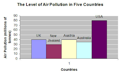
The graph represents the Air pollution in terms of millions of tonnes on the y axis and countries on X asix. It aims to give a conclusive analysis on the amount of air pollution in five countries namely UK, New Zealand, Australia, USA. The air pollution is highest in USA with 80 millions of tonnes and least in New Zealand with 30 millions of tonnes. With the alarming increase in Air pollution, now is the time to take measures against air pollution.
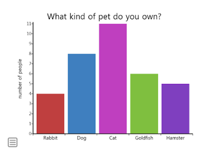
The above graph shows a survey conducted among 35 members on what kind of pet they own. Eleven members own cat as a pet. Eight members own dog as a pet. Six members own goldfish as a pet. Five members own hamster as a pet. A very less number of people own rabbit as a pet.
The above graph shows the serious crime rate in Cincinnati. In 2001 twenty-six thousand crimes were registered. In the year 2002 and 2003, most of the crimes were registered. Though there was a decrease in registration of crime rate in the year 2004, 2005 and 2006, they were equal to the crimes registered in the year 2001. The year 2007 and 2008 registration of the crime rate was the least. On an average serious crime rate in Cincinnati was around 26000 between the years 2001-2008.
Above is the graph with ratings of six Pixar movies. The highly-rated movie is Ratatouille, it was rated 96. And the least rated movies were finding Nemo and The Increadibles. The next highly-rated movie is Wall-E. Toy Story 3 and Toy story were equally rated at 92. All the Pixar movies got good ratings, with an average rating of 92.
Everyone has a choice of flavor in ice-creams. Above is the graph, which shows the favorite ice cream flavors people like. The least liked Ice cream flavor is cookies and cream. The most liked Ice Cream is Vanilla. Chocolate and strawberry got an average response compared to other two flavors.
The above picture shows the life cycle of a Honey Bee. A queen bee lays eggs, it takes three days for the eggs to hatch. After hatching the eggs turn into Larva, after 9 days in the larva stage, it moves to the third stage. In the pupar stage, the third stage body starts to form. In the fourth stage, that is the adult stage, complete body is formed.
This pie chart refers to the average annual deaths attributable to cigarette smoking in the U.S. in 2005-2009. According to the chart, more than 479,989 deaths in that period are attributable to cigarette smoking. Specifically, 29% of these deaths were caused by lung cancer; 28% were caused by ischemic heart disease; 21% were caused by chronic obstructive pulmonary disease; 10% were caused by other related diagnoses; 4% were caused by stroke; and 8% of annual deaths from 2005-2009 attributable to cigarette smoking were caused by other cancers.
The given graph represents the Children employment rates or otherwise the child labor rates across the years 2004 and 2008 in few regions of the world along with the average percentage of the world as well. the highest amount of children employment overall was observed in the year of 2008 in the Sub Saharan Africa region whereas the least amount of child employment was seen in 2008 in the other regions of the world. On an average, the child employment was higher in the year of 2004 when compared to 2008; it is a clear indicator of development.
Describe Image PTE Practice
1. Describe Image PTE Question
 |
Describe Image PTE Practice |
2. Describe Image PTE Sample
3. Describe Image PTE Exercise
4. Describe Image PTE Bar Graph
5. Describe Image PTE 2018 Bar Graph
Everyone has a choice of flavor in ice-creams. Above is the graph, which shows the favorite ice cream flavors people like. The least liked Ice cream flavor is cookies and cream. The most liked Ice Cream is Vanilla. Chocolate and strawberry got an average response compared to other two flavors.
6. Describe Image PTE PIE CHART
The above pie chart shows the percentage of people using the medium to listen to music in 1983 and 1993. Cassettes were mostly used in 1983, whereas in 1993 CD's were mostly used. The second largest medium was LP/EP in 1983 and 1993 it was cassettes. CD's and Vinyl single were least used in 1983 and 1993 music videos, LP/EP, the vinyl single least used.7. Describe Image PTE Process
The above picture shows the life cycle of a Honey Bee. A queen bee lays eggs, it takes three days for the eggs to hatch. After hatching the eggs turn into Larva, after 9 days in the larva stage, it moves to the third stage. In the pupar stage, the third stage body starts to form. In the fourth stage, that is the adult stage, complete body is formed.
8. Describe Image PTE Repeated
The pie chart provides information concerning browser usage on wikimedia in October of 2011. I.E for instance, was used 34.2% of the time, followed by Firefox, which was used 23.6% of the time; chrome was used 20.6% of the time; Safari was used 11.2% of the time; Opera was used 5.0% of the time; Android was only 1.9% of the time; and other browsers combined were used 3.5% of the time.9. Describe Image PTE Real Exam Question
This pie chart refers to the average annual deaths attributable to cigarette smoking in the U.S. in 2005-2009. According to the chart, more than 479,989 deaths in that period are attributable to cigarette smoking. Specifically, 29% of these deaths were caused by lung cancer; 28% were caused by ischemic heart disease; 21% were caused by chronic obstructive pulmonary disease; 10% were caused by other related diagnoses; 4% were caused by stroke; and 8% of annual deaths from 2005-2009 attributable to cigarette smoking were caused by other cancers.
10. Describe Image PTE Exam Preparation
The given graph represents the Children employment rates or otherwise the child labor rates across the years 2004 and 2008 in few regions of the world along with the average percentage of the world as well. the highest amount of children employment overall was observed in the year of 2008 in the Sub Saharan Africa region whereas the least amount of child employment was seen in 2008 in the other regions of the world. On an average, the child employment was higher in the year of 2004 when compared to 2008; it is a clear indicator of development.


